
Data Flow Diagrams in Threat Modeling: From Whiteboard Sketch to Living Security Artifact

Image Source: depositphotos.com
Most threat modeling sessions that fail do so before anyone has said the word "threat." They fail because the team is arguing about how the system actually works. One engineer thinks authentication happens at the gateway; another is certain it happens in the service. Nobody can point to a shared picture, so the conversation drifts into architecture archaeology and the security questions never get asked.
This is why a data flow diagram (DFD) is the right place to start. A DFD forces the room to agree on where data comes from, where it goes, where it rests, and — critically — where it crosses a boundary between components that trust each other by different rules. Once that agreement exists, the threats tend to surface on their own.
Trust boundaries are the diagram's only reason to exist
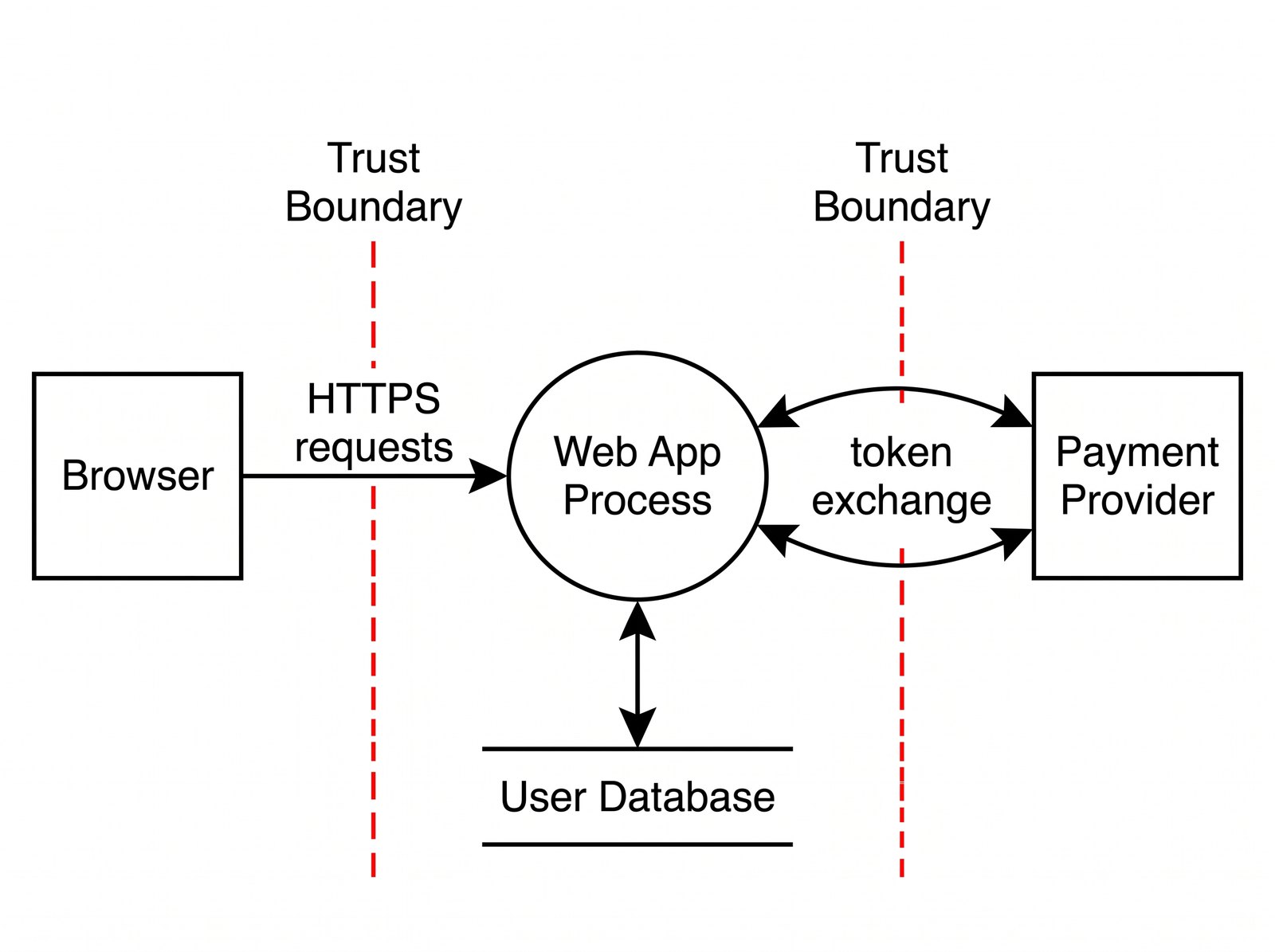
A DFD without trust boundaries is just an architecture diagram, and architecture diagrams are not security artifacts. The boundary is where the analysis lives. It marks the line where data moves from a zone under one set of assumptions to a zone under another: unauthenticated to authenticated, tenant A to tenant B, your process to a third-party API, application memory to a database on shared infrastructure.
The discipline is to draw the boundary where control actually changes, not where the org chart or the network topology suggests it should. A microservice mesh inside a single VPC can still contain a dozen meaningful trust boundaries if services enforce different authorization scopes. Conversely, two "separate" systems that share a signing key and blindly trust each other's tokens may have no boundary between them at all, however far apart they sit on the network map. Draw the boundary at the point of changing assumptions, and every arrow that crosses it becomes a question worth asking.
Choosing the right granularity
The most common mistake is picking one altitude and staying there. A single diagram cannot be both a system-wide map and a function-level inspection, and trying to make it both produces a diagram nobody reads.
Work at two levels deliberately. A system-level (context) DFD shows major components and the boundaries between them — enough to reason about the platform's overall attack surface and to brief a CISO in five minutes. A function-level DFD zooms into one flow that carries risk: the password reset path, the file upload pipeline, the webhook that mutates billing state. That is where per-element analysis earns its keep. The rule of thumb: go one level deeper wherever data crosses a boundary and something sensitive changes hands. Everywhere else, stop.
Speed matters here more than polish, because a diagram that takes an afternoon to draw will not get drawn during a sprint. Sketching the flow quickly — even from a plain-text description of the components and their connections — lowers the barrier enough that modeling happens at design time instead of never. A generator like ConceptViz can turn that description into a labeled DFD in minutes, which is usually the difference between a model that exists and one that stays a good intention.
Keeping the diagram alive
A DFD is a liability the moment it stops matching the system. Threat models rot faster than code because architecture changes rarely announce themselves as security-relevant — a new caching layer, a queue inserted between two services, an added third-party integration. Each of these can move or erase a trust boundary, and a stale diagram will quietly hide the new exposure.
Treat the diagram as source-controlled artifact, not a slide. Store it beside the code, review it in the pull request that changes the relevant flow, and make "does this move a trust boundary?" a line item in design review. When the topology of a system shifts — new segments, new ingress paths, new internal services — a companion network view helps confirm the boundaries you drew still map to reality, so the security boundaries and the network segments can be checked against each other rather than assumed to agree.
Connecting the diagram to STRIDE
The diagram is the setup; STRIDE is the analysis. The value of Microsoft's STRIDE framework is that it maps cleanly onto DFD element types, which turns a blank-page brainstorm into a checklist.
Walk each element and apply the categories it is prone to. External entities invite Spoofing and Repudiation. Data flows — especially those crossing a trust boundary — invite Tampering, Information Disclosure, and Denial of Service. Data stores carry Tampering, Information Disclosure, Repudiation, and DoS. Processes can suffer all six. Because you have already marked the boundary-crossing flows, you already know which arrows deserve the hardest scrutiny; STRIDE just tells you what to ask about each one.
The broader method, including how to run the elicitation as a team, is documented well in the OWASP Threat Modeling guidance, which is worth reading alongside your first few sessions.
In practice
Keep the diagrams small and plentiful rather than large and rare. Draw one per risky flow, version it with the code, and revisit it whenever a design review touches a boundary. Spend your effort on the arrows that cross trust boundaries, because that is where nearly every finding will originate. And resist the urge to make the diagram beautiful — a legible sketch that gets updated after every architecture change protects a system far better than a polished one that was accurate only on the day it was drawn.